How Simple Features of the iPad Menu Win Over Your Customers2 min read
When people think about technology, they often think: “Well this will be difficult for me to learn and use.” With PCs and some certain software releases, indeed, such was the case. However, thanks to the pioneers over at Apple, the iPad is truly simplified, easy-to-use and fun. Millions of people love using their iPad so much and so often that they rarely even use their desktop computers anymore.
That’s how you spell convenience married with technology. Under that same premise, we were certain to design the iPad menu to be as easy-to-use and as enthralling of an experience as the iPad tablet offers. Now, instead of a dull and static paper menu, you could be offering an elegant and feature-rich, touch-screen iPad menu that’s as simple and fun to use, and as refined and brilliant, as the technological platform that hosts it.
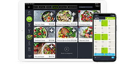
So just how simple and easy is the iPad menu by Open to use? We designed our digital menu software with both the restaurateur and the patron in mind. We didn’t want digital menus that were going to baffle and confuse your guests and staff; we wanted digital menus that were fun, thrilling and engaging, and that would help drive more sales and keep your customers coming back time and time again. Today, we take a look at our menus from the customer’s point of view. The following picture (below) can easily outline some of the finer points of our menus, and serve to better illustrate why they are such winners with hungry patrons. Click on the picture to learn more about our digital menu software.
Now you could be offering the next generation of digital menus with an iPad menu by Open. Find out how affordable our All-in-One solution is, and learn more about our 90 day buyback guarantee. Your sales spike, or we eat it and buy back your menus. Learn more about an iPad menu by Open.


